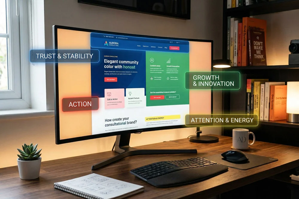
Understanding the Psychology of Color in Web Design is one of the most critical skills for creating digital experiences that resonate with users. As a web developer, it is easy to get lost in the technical intricacies of building a site. However, before a visitor ever interacts with your flawless JavaScript or perfectly structured HTML, they process the visual language of your website.
Colors are not just aesthetic choices; they are powerful communication tools. They can dictate a user's mood, influence their purchasing decisions, and build immediate trust.
At Web Design AD, we know that a beautifully customized WordPress site requires more than just clean code. It requires a deep understanding of human behavior. Today, we are going to dive deep into how you can leverage these psychological principles to create better user experiences and drive meaningful engagement.
Why the Psychology of Color in Web Design Dictates User Behavior
When a user lands on a website, it takes them less than a second to form an opinion about the brand. A massive part of that split-second judgment is driven by the color palette.
The Psychology of Color in Web Design plays an essential role in conversion rate optimization (CRO). If you want visitors to subscribe to your Mailchimp newsletter, click a "Buy Now" button, or fill out a contact form, you must use colors that guide their eyes and emotions toward those specific actions.
From a development perspective, we use CSS to implement these colors, ensuring they display consistently across all devices. But the strategic choice behind those CSS hex codes is what separates an average website from an exceptional one.
The Power of First Impressions
Colors communicate brand values instantly. If a corporate law firm uses neon pink and bright yellow, it creates a cognitive disconnect. Users expect stability and professionalism, which are typically represented by deeper, more subdued tones. Aligning your visual identity with user expectations is the foundation of excellent design.
Decoding the Psychology of Color in Web Design: Core Meanings
Let’s break down the primary colors and explore how they are traditionally perceived in the digital space. Keep in mind that cultural context can shift these meanings, but the following are generally accepted standards in modern UI/UX.
Red: Urgency, Passion, and Excitement
Red is a highly stimulating color. It increases the heart rate and creates a sense of urgency. This is exactly why clearance sales and error messages frequently utilize shades of red.
In web development, using red for primary Call to Action (CTA) buttons can significantly increase click-through rates. However, it must be used sparingly. Overusing red can make a website feel aggressive or overwhelming to the user.
Blue: Trust, Security, and Professionalism
When you think of the internet’s biggest platforms—like Facebook, LinkedIn, or Twitter—blue is the dominant force. Blue inspires trust, calm, and security.
For corporate WordPress themes or financial institutions, blue is often the go-to primary color. It reassures the user that their data is safe and that the business is reliable. When customizing a WordPress site for a B2B client, weaving different hues of blue through your CSS can instantly elevate the site's perceived authority.
Green: Growth, Harmony, and Nature
Green is the easiest color for the human eye to process. It is universally associated with nature, growth, health, and wealth.
If you are building an e-commerce site focused on organic products, or a financial dashboard tracking investments, green is incredibly effective. It creates a calming user interface that encourages visitors to stay on the page longer.
Yellow: Optimism, Youth, and Attention
Yellow is the color of sunshine. It radiates positivity and optimism. Because it is highly visible, it is fantastic for drawing attention to specific elements on a page.
However, yellow can also cause eye strain if used improperly. As a developer, I often use Photoshop and Illustrator to test different shades of yellow against background colors before ever writing a line of code. Ensuring proper contrast is key to maintaining readability.
Applying the Psychology of Color in Web Design to Your WordPress Site
Knowing what colors mean is only half the battle. The real challenge is implementing them effectively within your website's architecture. Here is how we approach color integration at Web Design AD.
1. The 60-30-10 Rule
One of the most reliable frameworks in digital design is the 60-30-10 rule. This principle helps maintain a balanced and visually appealing interface.
- 60% Primary Color: This is the dominant color, often used for backgrounds and large structural elements. It sets the overall tone of the site.
- 30% Secondary Color: This color supports the primary color. It is used for subheadings, secondary buttons, and highlighting key sections.
- 10% Accent Color: This is your boldest color. It should be reserved exclusively for your most important CTAs, like "Submit" buttons or limited-time offers.
2. Creating Consistency Across Platforms
Your website does not exist in a vacuum. The Psychology of Color in Web Design extends to your entire digital footprint. When a user transitions from your custom WordPress site to a promotional email, the visual experience should be seamless.
This means your Mailchimp templates must utilize the exact same hex codes as your website's CSS stylesheet. Brand consistency builds trust, and trust leads to conversions.
3. Utilizing White Space (Negative Space)
While discussing the Psychology of Color in Web Design, we must also talk about the absence of color. White space is critical for cognitive processing. It gives your colorful elements room to breathe.
A cluttered website overwhelms the user. By utilizing white space effectively, you guide the user's eye naturally down the page toward your intended conversion points.
Technical Considerations for Color in Web Development
As professionals with years of experience navigating HTML, CSS, PHP, and JavaScript, we know that implementing color isn't just about picking pretty shades. There are technical standards that must be met.
Accessibility and Contrast Ratios
Web accessibility is no longer optional. When designing a color palette, you must ensure that there is sufficient contrast between your text and background colors. If a user cannot read your content, the psychological impact of your colors is irrelevant.
We always recommend testing your color choices against the Web Content Accessibility Guidelines (WCAG). You can learn more about WCAG contrast standards here to ensure your site is inclusive to all users.
CSS Custom Properties (Variables)
To manage complex color palettes efficiently, modern web development relies on CSS variables. Instead of hardcoding hex values throughout your stylesheet, you define them globally.
This allows for rapid prototyping and theme switching. If a client wants to shift their primary color from blue to green to better align with the Psychology of Color in Web Design, changing a single CSS variable updates the entire WordPress site instantly.
Elevating Your Brand Through Strategic Color Choices
Every color you choose sends a subconscious message to your audience. Whether you are using Photoshop as a beginner to mock up a logo, or writing advanced PHP to customize a dynamic WordPress theme, color must remain at the forefront of your strategy.
By understanding how different hues trigger different emotions, you can craft digital experiences that are not only beautiful but highly effective at driving business goals.
At Web Design AD, we specialize in merging technical expertise with proven psychological design principles. We don't just build websites; we build strategic digital assets designed to perform.
If you are ready to elevate your online presence and want a website built with intention, clean code, and SEO best practices, contact us for custom WordPress development today. Let's create something powerful together.